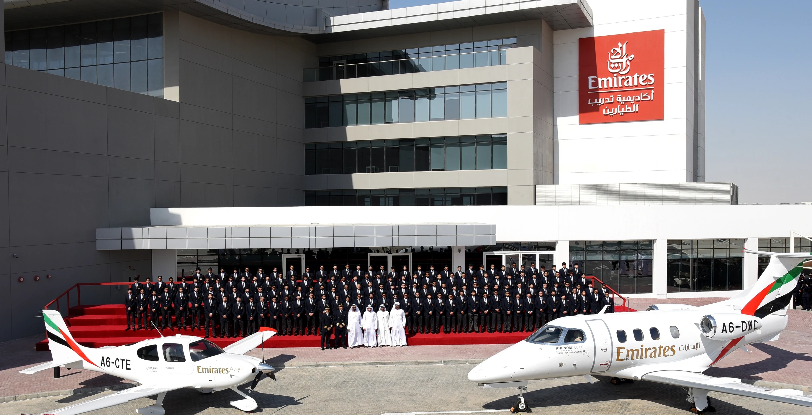
Emirates Flight Training Academy.
The full brand identity and go-to-market for the launch of one of the world's most advanced pilot training facilities — designed to pair Emirates' standard of precision with the ambition of the next generation of pilots.
Launch a school as a statement of intent.
This was not simply opening a training facility. EFTA was Emirates' answer to a global pilot shortage — a purpose-built academy designed to become the world's leading source of ab-initio pilot training, built from the ground up while the building was still under construction.
The brief was to develop the full brand identity — from brand essence and visual language to environmental design across every space in the building — and then take that brand to market before the first cohort had applied.
Go Beyond.
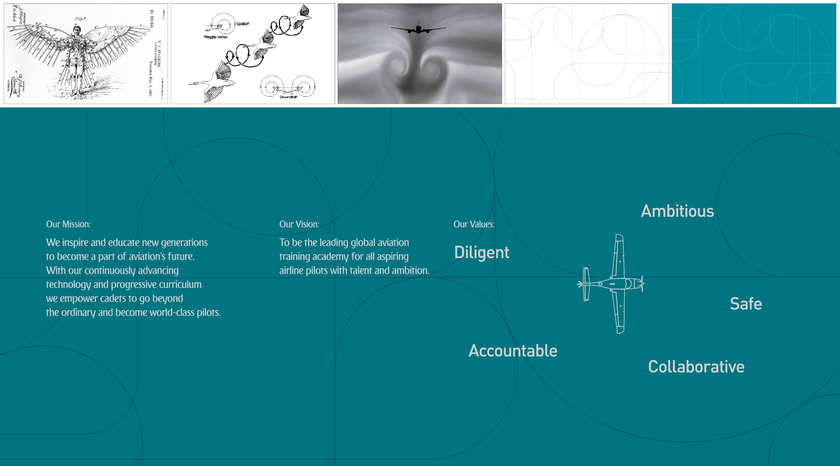
The brand essence came from a positioning audit across the aviation-education sector — an industry found to be visually and tonally homogenous. The opportunity was differentiation at every level, from the founding philosophy to the typeface on the wall.
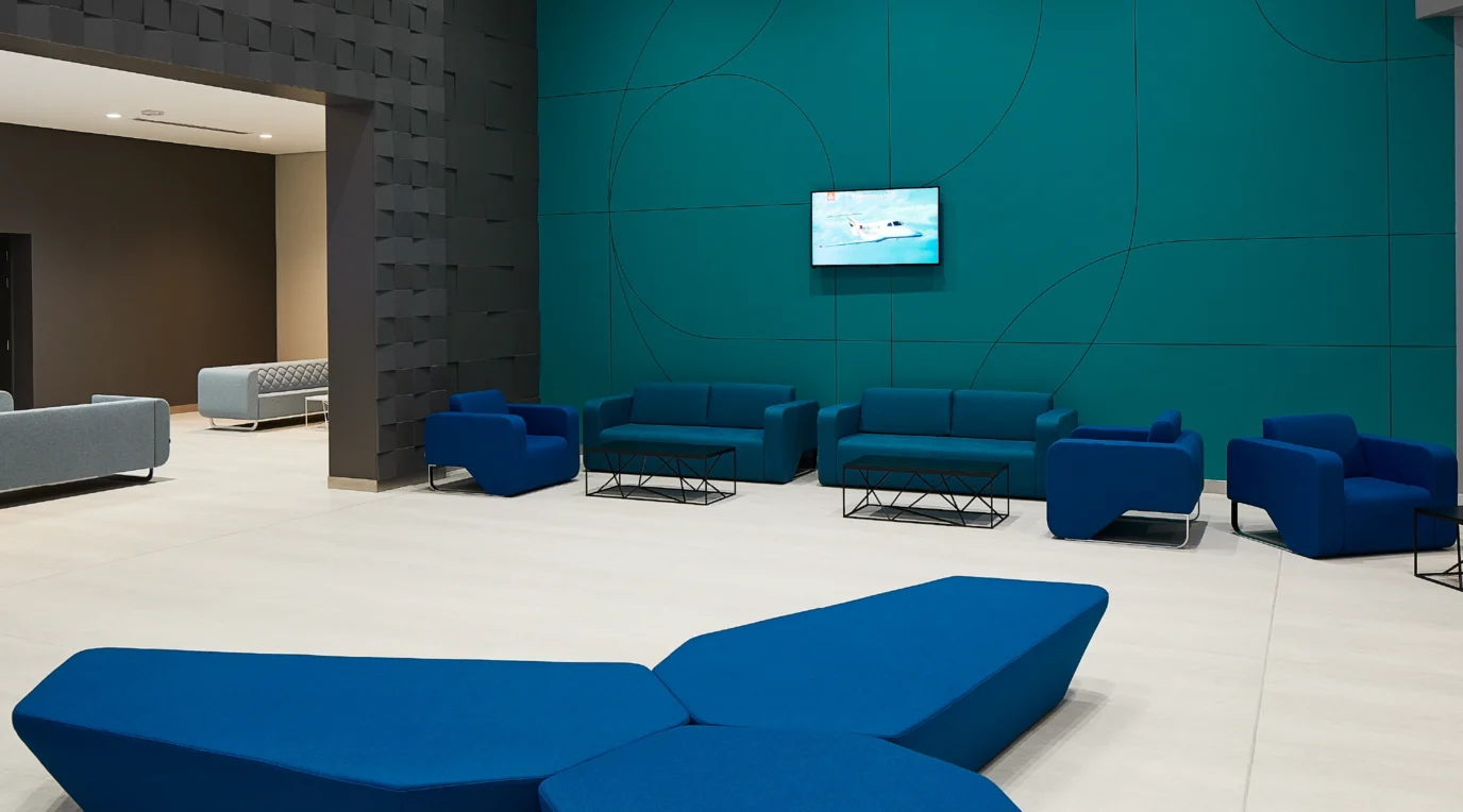
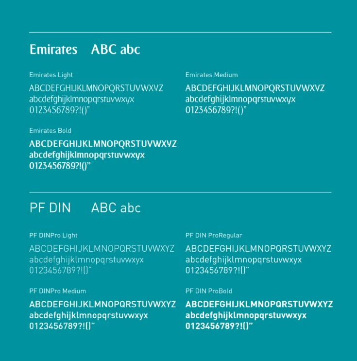
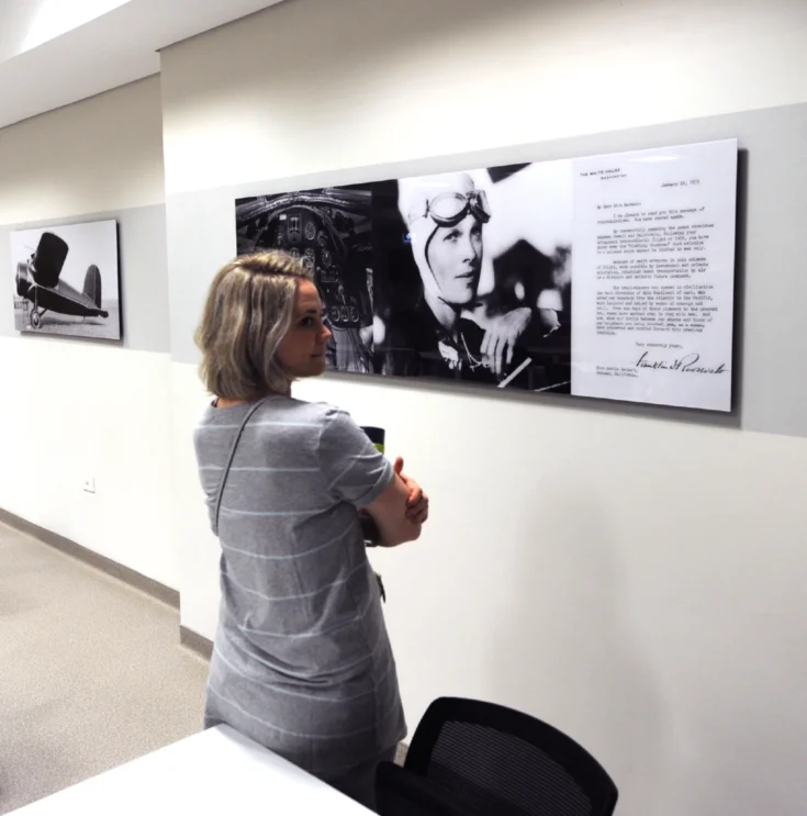
The visual language drew on biomimicry — the flight paths of birds that have inspired aviators for centuries — expressed through a colour palette drawn from cockpit light and typography rooted in the transportation sector. The identity extended through every physical space: atriums, classrooms, corridors, and residential areas, carrying aspirational quotes from pioneering aviators and imagery from Emirates destinations around the world.

An inaugural intake, filled fast.
A brand strong enough to attract the world's most ambitious young pilots — and a recruitment proposition that filled every place in the first intake within two months of launch.